news channel & Branding-jurnal petang beritasatu
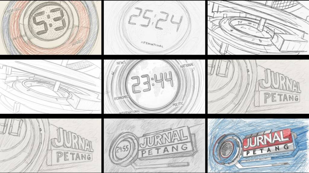
ProductionBeritaSatuYear2012DescriptionThis opening was created in 2012, built around the idea of “Time as Authority” — recognizing that in the world of news, time is both the most critical element and a symbol of credibility. The primary element, a circular digital clock interface, represents precision, continuity, and the constant rhythm of information. The circular form symbolizes the daily news cycle—from morning to midday to evening—positioning this program as the moment of reflection and consolidation at the end of the day. The large moving digital numbers create a real-time update impression, reinforcing the program’s positioning as responsive and up-to-date. Layered radial graphics and ring elements add depth and motion, conveying a sense of modern technology and an integrated information system. The red and blue color palette expresses a dual character: Red symbolizes urgency, breaking news, and the dynamic nature of events. Blue conveys stability, trust, and editorial credibility. Bold, structured typography emphasizes authority, while the horizontal title bar composition creates a grounded and stable presence—reflecting a strong journalistic foundation. Overall, this concept positions Jurnal Petang as an authoritative, modern, and time-driven evening news program—delivering information with precision, speed, and trust.